|
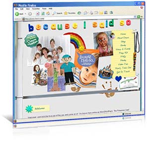
URL: http://www.becauseIsaidso.com Pages: 15 See Before & After Screenshots! Nationally acclaimed mom blogger and new author Dawn Meehan wanted a web site and complete redesign for her blog. She needed something bright and fun that reflected her fabulous sense of humor and the joys and adventures of motherhood. PulsePoint complied with a custom web site and matching blog featuring a one-of-a-kind refrigerator design! We featured art and photos from Dawn’s kids, a to-do-list style navigation menu, and magnets to mark key sections. Then we added a massive Mom’s Time Out games page, a custom coded YouTube video feed, and a Hate Mail page that has become legendary, to complete Dawn’s fun new look.
|
|
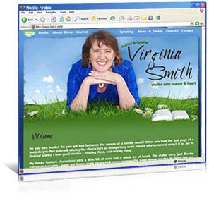
URL: http://www.virginiasmith.org Pages: 12 See Before & After Screenshots! Author Virginia Smith wanted a full re-design from her existing site. She wanted something fresh and inviting with a writing flair that conveyed her bright, fun personality while coordinating with her books’ varied genres. PulsePoint Design created this sparkling sky and daisies design for Ginny, featuring taped note paper, a customized matching journal, and a fantastic Reader Fun page. We included a captcha service on all Ginny’s web forms to protect her from spam, and finished the design by coding it into a content management system so she can easily manage all the pages of her site, anytime, anywhere.
|
|
Pages: 7 New historical author Ann Shorey wanted a rich, warm web site that would appeal to readers of her soon to be released At Home in Beldon Grove series. PulsePoint Design rose to the challenge with this gorgeous coral, blue-gray, and sand design. We framed her site in a pebbled rose texture, edged her old paper pages with soft blue-gray leather, and added a fantastic vertical tabbed menu along the side. Old envelopes and photos, matching business cards, an amazing matching blog, and a truly incredible story-behind-the-story page complete Ann’s beautiful new site.
|
|
URL: http://www.shawngradybooks.com Pages: 8 Fireman and new author Shawn Grady wanted to start his career off right with a strong internet presence that reflected the adventure and suspense of his work. Shawn also needed his site completed, from mock-up to launch, in less than two weeks. PulsePoint rose to the challenge with this rugged, literary design, featuring a torn cardboard navigation menu, weathered background striping, and a strong outdoor/adventure feel. We completed his site with a built-in reader forum and a customized music player, and set the whole thing up on a content management system so Shawn can edit any page of the site as easily as a blog post!
|
|
URL: http://www.terriblackstock.com Pages: 31 See Before & After Screenshots! Best-selling author Terri Blackstock came to us wanting a complete redesign from her existing site. She wanted a design that was richer and better reflected her Up All Night Fiction brand. PulsePoint Design complied with this modern, vivid, rust, green, and black nightscape design. We created a fantastic rotating books image featuring her latest books for the home page, a custom designed media player including all her latest audio clips and podcasts, and a built-in journal to allow her to share thoughts without the pressure of a daily blog. Last, we set up the entire site on a content management platform, to allow Terri to update her site whenever and wherever she chooses.
|
|
URL: http://www.tameraalexander.com Pages: 12 See Before & After Screenshots! Historical author Tamera Alexander came to us looking for a change from her existing site. She needed a design that was easier to navigate, cleaner, and featured an updated author photo and a warmer overall look. PulsePoint responded with this spectacular green, garnet and gold design, featuring aged paper, vivid scenery, and clean lines. We coded the entire site onto a content management platform, so Tamera can handle her own updates, then built in a scrolling Flash-based book box and blog excerpt box, and three spectacular Flash photo albums that pull directly from her Flickr feed to complete the new look.
|
|
URL: http://www.saramitchellbooks.com Pages: 12 Historical author Sara Mitchell wanted a rich literary design to coordinate with her thoughtful Southern fiction. PulsePoint Design rose to the challenge with this ruby, sage, and soft leather design, crowned with gilded art, a blossoming dogwood tree, and a vintage lamp. We built the room in Sara’s header piece by piece and pixel by pixel until everything was just right, then supported it with a vintage navigation bar featuring a dogwood flower in the hover state. Then we added a jaw-dropping Flash-based photo album featuring historical photos, a scrolling 1890s trivia box, and a captcha protected contact form, so Sara can hear from readers while escaping spam.
|
|
URL: http://www.harrykraus.com Pages: 11 See Before & After Screenshots! Author & missionary surgeon wanted a full overhaul of his existing site. He needed a design that maintained some of his existing site colors, but also worked in elements from his work as a surgeon, a missionary to Africa, a suspense novelist, and a non fiction author. PulsePoint complied with this strong, medical themed design. We create a scrolling, Flash-based books box, and a blog excerpt box for Harry’s home page, added a custom coded photo album featuring some of Harry’s favorite photos from the field in Africa, then designed a coordinating blog to complete his online brand.
|
|
URL: http://www.gayleroper.com Pages: 14 See Before & After Screenshots! Acclaimed author and teacher Gayle Roper wanted a total re-design of her old site. She needed a new look with a writing flair that incorporated her ministry logo and her favorite photos. PulsePoint rose to the challenge with this gorgeous raspberry, cream, and forest green design, featuring bent page edges, a cluster of Gayle’s best photos, and monogrammed wax seals. An easy mailing list sign up for readers, custom designed sample chapters, and a Flash-based photo album that automatically pulls from Gayle’s Flickr account completed Gayle’s beautiful new look.
|
|
URL: http://www.skylineengineering.com Pages: 7 See Before & After Screenshots! Bryan Schalesky, president of Skyline Engineering and husband to one of our fabulous clients (author Marlo Schalesky) came to PulsePoint Design looking for a re-design of his existing, self-maintained site. He wanted a clean, professional look, a custom logo design, and a place to showcase photos of the company’s projects. PulsePoint complied with this sleek coal gray and soft blue design. We created a fantastic skyline-oriented logo to coordinate with the company name, then worked in an easy-to-navigate menu, and a Flash-based photo portfolio of the company’s work to complete the site’s new look.
|
|
URL: http://www.jonathanfriesen.com Pages: 10 See Before & After Screenshots! New YA author Jonathan Friesen came to PulsePoint with three challenging requests: 1.) Could we create a grungy, organic, art-flavored site with strong animated elements, and no straight or square edges? 2.) Could we create this site to appeal to a young, primarily male demographic? 3.) Could we create an eye-catching site using a snapshot taken from the back as the primary author photo? PulsePoint Design said “Yes!” We worked with the author snapshot until it looked like a painting, and set this image in a field in front of an old wall-featuring wall art as the navigation menu. Then we animated the sky, the wall itself, the vines on the wall, and even the wall art so that each element came alive. A blog excerpt box, grunge fonts, a feature-rich contest page, and rich, speckled gold pages completed Jonathan’s great new look.
|
|
URL: http://www.karenballbooks.com Slogan: Rugged Faith, Radiant God Pages: 13 Author & Editor Karen Ball wanted a change from her self-maintained site to a fresh new design that displayed her professionalism, industry experience, love for the outdoors, and fabulous sense of humor. PulsePoint complied with a rich, open-book design sure to capture her readers’ imagination! We worked with a world-renowned Oregon photographer to find just the right header image, then sent in a pair of swooping birds to make the image dynamic. We framed the site in the deep green of the Oregon forest and edged it with warm brown book leather, then crowned it with a marketing slogan that conveyed Karen’s heart and vision. A custom coded, Flash-based, Authors and Their Pets quiz, a coordinating blog, and a built-in content management system completed this radiant new design. Karen’s site won the silver web award for excellence in web design from the American Association of Webmasters.
|
|
URL: http://www.triciagoyer.com Slogan: Honor the Past, Embrace the Future Pages: 15 Author Tricia Goyer came to us with a major challenge: Could we create a design that not only suited her personality, and included her favorite colors, but also coordinated with, and unified her historical novels, GenX books, and young adult non fiction titles? We said, “Yes!” We framed Tricia’s design in deep rust and swirls of sable brown. Next, we drew in the mossy green from her fantastic header image, added hints of grunge to her parchment pages, brainstormed the perfect marketing slogan, and...voila! Her historicalgenXyoungadult author site was born. PDF sample chapters and discussion guides, matching blog designs, a built-in content management system, and polaroid-style photos scattered throughout the pages added the finishing touches to Tricia’s great new look.
|
|
URL: http://www.katiecushman.com Pages: 6 Author Kathryn “Katie” Cushman wanted to start her new writing career with a solid online presence. She needed a web site design that was both engaging and easy-to-navigate, and pages that conveyed warmth and fun with a writing flair. PulsePoint rose to the challenge with a design we like to call “Monet meets Santa Fe”. Katie’s site features deep terra cotta and gray blue, with torn paper edges, ink spots, and photos scattered about to add warmth. Most unique about Katie’s site is her Fun page, an absolute TREASURE for online game lovers. On this page, readers can write their own mad-lib with one of Katie’s sample chapters, play a book worm game, assemble a puzzle from her new book cover, play a crossword puzzle using keywords from her novel, and even draw pictures using an online etch-a-sketch! A custom designed blog and a coordinating sample chapter and discussion guide for her new book complete this fantastic site.
|
|
URL: http://www.marloschalesky.com Slogan: Tales of Wonder Pages: 9 Author Marlo Schalesky came to PulsePoint in need of a clear brand, and a complete re-design for her self-maintained site. She wanted a site that reflected depth and richness, as well as a hint of surprise and wonder. She also needed an online identity that coordinated with her upcoming releases, a “Nicholas Sparks meets M. Night Shymalan” trio. PulsePoint responded by creating a vivid, truly awe-inspiring layout for her site. We framed the design in deep gray, black, and tan cobblestone. Then set aged wooden doors in the center and threw them open to reveal a breathtaking ocean scene in which the sun rises and sets right before the viewer’s eyes. An imbedded music player, wrought-iron sidebars, cozy chairs, a glowing street lamp, and books that mysteriously appear and disappear complete the sense of surprise and wonder for Marlo’s new look.
|
|
URL: http://www.kathleenmorgan.com Pages: 13 Award-winning novelist Kathleen Morgan needed a change from her existing site to something that better expressed her personality and the rugged romance of her stories. She wanted a site that was inviting, attractive, and offered readers the chance to stay in touch and easily find more information about her latest books and events. PulsePoint was delighted to comply. We cloaked her site in a thick Scottish plaid, edged the pages with brown leather and moss green, and crowned it with a windswept castle. A torn-parchment navigation menu, scrolling sword-edged book image, customized newsletter sign-up box, and unique Scottish word of the day box added the final polish to Kathleen’s marvelous new design.
|
|
URL: http://www.janeorcuttbooks.com Pages: 5 When beloved author Jane Orcutt passed away from leukemia just months before her new book released, her author friends banded together to promote the book themselves. The ChiLibris author group, in cooperation with the Books & Such literary agency and Revell publishers, contracted PulsePoint Design to create a new site for Jane. We were deeply honored to create this site, and determined to design something that Jane would have loved, and that would best represent her style and her new book. So, we wrapped Jane’s site in a rich terra cotta background, then, to coordinate with her new book, we brought in an old typewriter, tea pot, map of China, British passport, and rough-weave canvas for the site title. A fabulous podcast player for her audio book excerpt and audio tribute, an integrated guestbook where visitors can leave notes for Jane’s family, and hidden treasure links in the header completed this warm new design.
|
|
URL: http://www.sharonhinck.com Slogan: Stories for the Hero in All of Us Pages: 18+ Sharon, one of our long-time clients, came to us with a great problem: Her career was expanding, and her online brand needed to expand with it. Could we create a new look for her that encompassed her mom-lit books, her new Christian fantasy books, a professional image that maintained a hint of whimsey, plus at least four different shades of blue, AND set up the entire new design on the WordPress blogging system so she could handle updates herself? We said, “absolutely” We created a new design for Sharon that featured her (great!) new author photo, deep blues, swirls and crosses to add that hint of whimsey, and a rich, jewel-toned divider bar. Next, we added expandable navigation menus, a fun, what-book-character-are-you quiz, and a custom press page for media . Last, we set the whole thing up on WordPress, so Sharon can keep her pages current from anywhere there’s an internet connection, and included a matching blog design for her existing Blogger account so that her blog and web site are perfectly coordinated.
|
|
URL: http://www.mydakotatrailways.com Slogan: Adventure is waiting. Let us take you there. Pages: 7 When client Lauraine Snelling told us about a South Dakota bus company in need of a design, we were hesitant. After all, we’re author people. Could we really help this company market their bus services? The answer, we discovered, was an overwhelming “Yes!”. In a busy corporate world, the family-owned Dakota Trailways stands apart, and they gave us a lot to believe in. To create their new image online, we brainstormed a specific tag line for their company. Then we designed a dynamic flash header, with rotating photos from the Black Hills. We dressed the site in black and gold, then added easy navigation, client testimonials, bus services and descriptions, and a downloadable job application form to complete their strong new image. Drive on Dakota Trailways!
|
|
Slogan: Building a bridge between yesterday & tomorrow Pages: 18+ Author BJ Hoff approached PulsePoint Design with a major challenge: Could we completely redesign her old site, AND set up the entire new design on the WordPress blogging system? We said, “yes!” We created a whole new look for BJ—featuring rich Celtic crosses and old book pages to coordinate with her historical fiction genre—and then framed the design in soft teals, smoky blues, and shades of caramel. Next, we added a customized audio player for BJ’s story excerpts, an insanely cool Flash-based quiz, and a leave-a-voicemail option on her contact page. Last, we set the whole thing up on WordPress, so that BJ can now update any page on her site as easily as she’d write a blog post. Fabulous!
|
|
URL: http://www.wendylawton.com Pages: 12 Renowned dollmaker and author Wendy Lawton needed a total redesign for her site. Her existing site was outdated and she needed something that was warmer and more contemporary. PulsePoint Design responded with a perfect mix of class and artistry. Because we knew Wendy loved gardening as well as writing, we blended soft ribbons of coral and leather with a gorgeous flower image and script watermarks, and then framed the whole design in rich red. Special features for her readers including sample chapters, study guides, and downloadable bookmarks add the finishing touch to this beautiful new site.
|
|
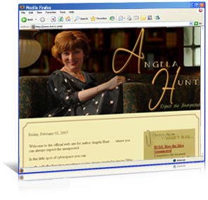
Site: Author Angela Hunt URL: http://www.angelahuntbooks.com Pages: 27+ Best-selling author Angela Hunt contacted PulsePoint Design looking for a complete web redesign for her large, robust-content site. She wanted to go beyond the basic black and white design she had, to something new and rich that conveyed her professionalism while adding just a hint of the unexpected. PulsePoint Design rose to the challenge. We layered several photos to create Angie’s header image, then brought in warm library colors-- rich greens, tans, and burgundys--for the site pages. Features such as a post-it note blog excerpt box, Amazon aStore, custom designed Flash box for her latests books, specialty shoutbox for visitors, PDF sample chapters, and page of special resources for readers complete Angie’s gorgeous new design.
|
|
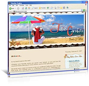
Site: Author Julie Carobini URL: http://www.juliecarobini.com Slogan: Catch the Wave Pages: 6 New author Julie Carobini asked PulsePoint Design for a full site re-design, to help her prepare for the release of her first book. She wanted a site that was bright and beach-oriented, but needed something a little more dynamic than her existing design. PulsePoint Design responded with a smart, sunny, multi-colored beach design. We drew in all of the colors from her new book cover, then added sand, surf, and starfish. A customized newsletter sign-up box, blog excerpt box, sunshine favicon for the url bar, and coordinating blog design complete Julie’s super-fun new look.
|
|
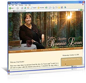
Site: Author Bonnie Leon URL: http://www.bonnieleon.com Slogan: Unveiling Truth Through Fiction Pages: 6 Author and speaker Bonnie Leon needed a total remodel of her current site, from pastel colors and clip art to something that portrayed her love for nature, her emotional depth, and her thought-provoking writing style. PulsePoint Design responded with a site that literally glows. We contracted a world-renowned Oregon photographer to provide Bonnie’s header background, then wrapped her pages in warm earth tones, and highlighted them with features like a blog excerpt box, and gorgeous script fonts. A matching blog, specialized marketing slogan, and coordinating business cards completed Bonnie’s classy new look.
|
|
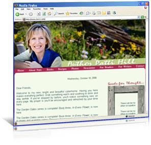
Site: Author Patti Hill URL: http://www.pattihillauthor.com Pages: 12 Christian author Patti Hill came to PulsePoint Design looking for a web redesign to correspond with the release of her third, award-winning book. Patti wanted something clean and natural that reflected her personality, but also offered readers a fun, informative, easy-to-navigate site. PulsePoint Design rose to the challenge with an outdoor garden theme that reflected Patti’s interests. We contracted a well-known Colorado photographer to provide Patti’s header background, then added a board-framed thought of the day box, Flash photo album, Flash reader testimonial box, downloadable .PDF sample chapters, and a custom Newsletter sign-up box to complete Patti’s fresh new design.
|
|
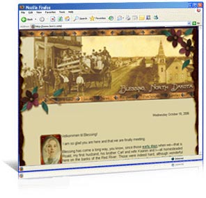
Site: The Official Site for Blessing, North Dakota URL: http://www.blessingnd.com Slogan: Blessed to be a Blessing. Pages: 7 Author Lauraine Snelling wanted to created a web site for Blessing, North Dakota, the beloved fictional town featured in many of her historical fiction books. PulsePoint Design was thrilled to put together such a unique site. We designed a header with images provided by the Drayton, North Dakota historical society, then framed those images with vines and prairie flowers. Brushed brass navigation menus, torn paper edges, a Flash-based newspaper with page-turning functionality, and a custom designed matching blog complete BlessingND.com’s rich, antique feel.
|
|
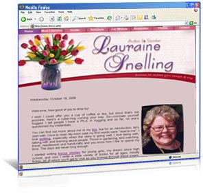
Site: Author Lauraine Snelling URL: http://www.laurainesnelling.com Pages: 30+ Author and teacher Lauraine Snelling needed a complete makeover for her home online; one that would update her image while keeping the colors that had become part of her brand. PulsePoint Design responded with a bright, floral site, spiced with script fonts and rich jewel colors of rose, purple, and red. A FAQ’s section, downloadable sample chapters and discussion guides, PayPal enabled purchase links, and a specialized photo album complete Lauraine’s beautiful new look.
|


|
| Home | About Us | Services | Portfolio | Clients | Contact Us | © PulsePoint Design, 2002-2013 All rights Reserved All web design and graphic design images and text on this site are protected by copyright and trademark laws. You may not copy, modify, sell, distribute, transmit, display, reproduce, publish, or license any images or text from this site without the express written permission of PulsePoint Design. |
 Site: Author Dawn Meehan
 Site: Author Virginia Smith
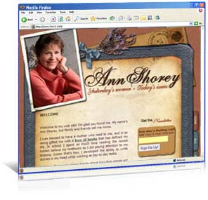 Site: Author Ann Shorey
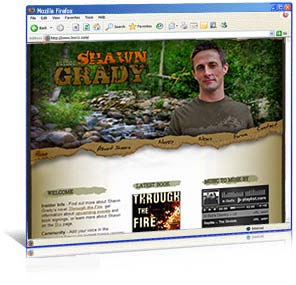 Site: Author Shawn Grady
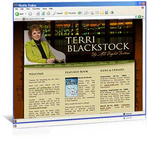 Site: Author Terri Blackstock
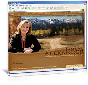 Site: Author Tamera Alexander
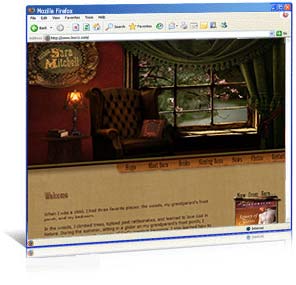 Site: Author Sara Mitchell
 Site: Author & Missionary Surgeon Harry Kraus
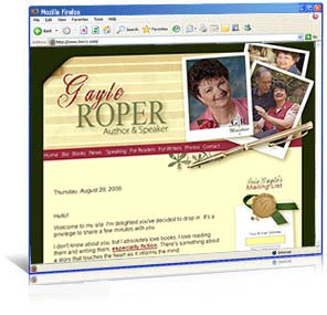 Site: Author Gayle Roper
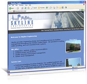 Site: Skyline Engineering
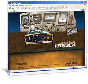 Site: Author Jonathan Friesen
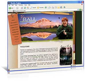 Site: Author & Editor Karen Ball
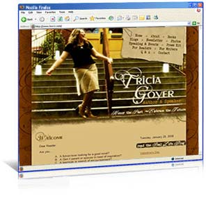 Site: Author Tricia Goyer
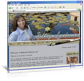 Site: Author Kathryn Cushman
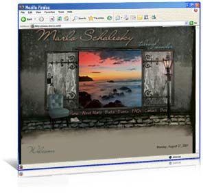 Site: Author Marlo Schalesky
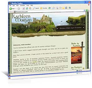 Site: Author Kathleen Morgan
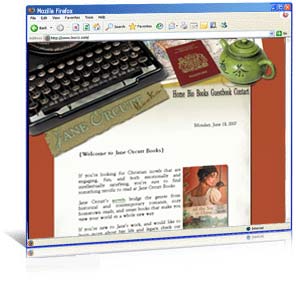 Site: Author Jane Orcutt - Tribute Site
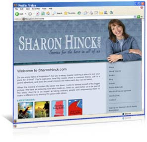 Site: Author Sharon Hinck
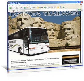 Site: Dakota Trailways Bus Co.
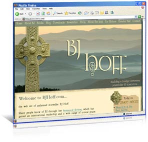 Site: Author BJ Hoff
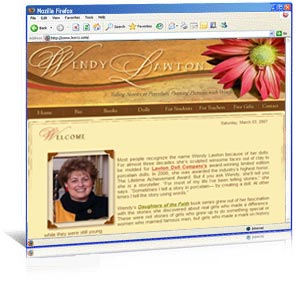 Site: Author & Artist Wendy Lawton